NoteNest
A native iOS app geared towards busy students who want to seamlessly integrate their notes from a multitude of platforms, while maximizing comprehension


Timeline: 8 Weeks
Role: UI/UX and Product Design
Tools: Adobe Illustrator, Figma, InVision
Introduction
The average university student takes about 40 classes throughout the course of their college career. Notetaking plays a critical role in determining the ultimate success in each of these classes, but figuring out the most effective strategy takes a lot of trial and error, and differs from course to course.
NoteNest is a native iOS app that seamlessly integrates notetaking with structure, allowing users to edit, consolidate, and organize their notes for easy retrieval on the go. A one-stop-shop for all notetaking needs, NoteNest is a flexible framework that supports an individual’s notetaking style, while also accounting for the essential comprehension process.
Problem
Class notes play a critical role in determining students’ comprehension and success, but they’re often disjointed and disorganized. The process of making sense of them is time consuming
Research
Preliminary Brainstorm
To understand the pain points in the notetaking process, I first needed to understand how students took notes, and what their existing techniques were.
I conducted preliminary interviews with fifteen 1st-4th year college students to gain insight into their methodologies throughout their academic journeys.

Need: Ways of transferring captured information to better understanding/comprehension
Personas
With a clear idea of what I needed to be designing, I set out to get a clearer idea of who I’d be designing for. I created two personas of university students, each with varying habits, methods, and goals…but both had the same struggle: they needed an effective note-taking system


Affinity Mapping
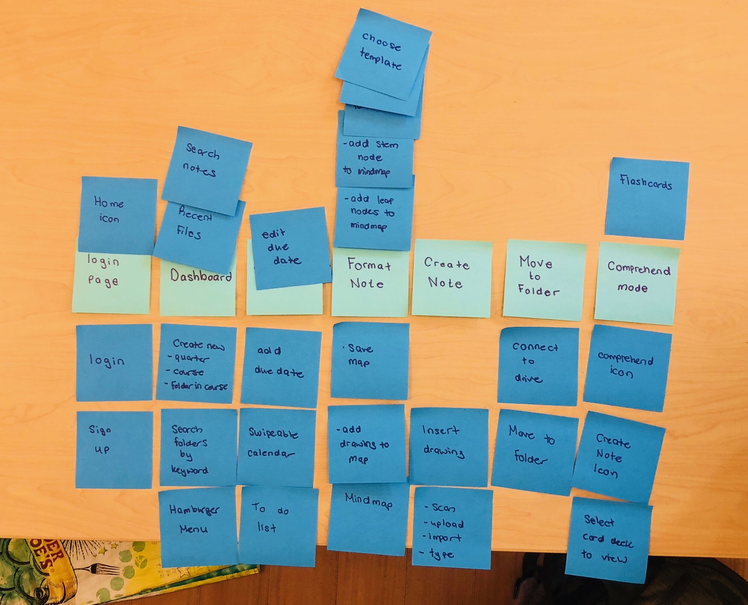
To get a visual representation of the problems I’d be solving, I jotted down each need and sorted them into general categories.
After the first mapping, I started to find patterns between individual needs, and clustered them into smaller problems to tackle
Time Management
Notetaking Style
Storage Method
Comprehension Strategies
General Shortcomings

Competitive Analysis:
Many of my interviewees had tried out note-taking apps in the past, but none of them had stuck with using them.
I decided to download a few and conduct a competitive feature analysis to find out what was missing. I wanted to see if any of the apps were universally applicable so I gave up my word processor and notebooks for the week and used used the apps as my primary note-taking strategy.
Bear had too much white space and notes stark against the colorless interface
Zoho notebook was too cluttered and the hierarchy was lost among the elements in the interface
Apple Notes was impersonal and disorganized leading users to disregard the app as a primary notetaking app

Feature Prioritization
After exploring the competition and trying it out firsthand, I was able to distill down the core needs of users from affinity mapping features that were necessary to solve the problem.
I made the decision to remove user-generated templates from the MVP which I’d originally brainstormed as a component of the app.
The features below are a balance of necessity and feasibility for the first launch. Even though smart-formatting is an unexpected feature, its high value will solve time-management, organizational, and comprehension problems, so I decided to include it in the MVP.

Ideate
User Testing Part I
I conducted a closed card sort with a few participants to see how they would naturally group the proposed features.
For the most part, the users placed the features into the same categories I’d used during the affinity mapping stage which was nice confirmation.
However many of the proposed search features within categories were confusing and seemed to be unnecessary so those were cut out from the MVP too in favor of a centralized location.

User Flow
With the categories set, and features in place, I mapped out a potential path that a user would take to upload, edit and comprehend a note. This task is the most complicated since it utilizes all the core features and pages, so I needed to make ensure it was natural, usable, and DOABLE!

User Testing Part II: Paper Prototype
Went back to the users again to test the flow with a paper prototype. I wanted to see how they would traverse through the app once they had a tangible interface with some visual cues. The users confidently traversed through each task, and were able to explain each feature. However, they had difficulty understanding the iconography, and felt that some of the buttons (add, next) were placed in unintuitive locations which impeded discovery
Even though the app was still in its early stages, I decided to research some design methodologies and realized that I hadn’t been following Human Interface Design standards! I redrew the prototype with updated iconography and the next user tests went off without a hitch.

Sitemap
With some of the pain points hammered out, I created the final sitemap, the last step before prototyping!

Prototype
Mid-Fidelity Wireframes + Annotations

Click here for a larger view of Mid-Fi Wireframes
Hi-Fidelity Wireframes
Some Design Decisions..
Color Palette - Primary: Blue (for productivity), Secondary: Green (for concentration)
Discoverability - Each course is color-coded for easy access, and consistent throughout pages
Typography - I did a mini-experiment and had participants read a passage written in 4 different fonts: Avenir, Times, Roboto, and SF Pro. They rated SF Pro as the most “readable” and pleasant and finished passages 15% faster!
Human Interface Design Standards - iconography, buttons, and flow is consistent with Apple’s guide to iOS design
Goal: Showcase the notes while still keeping the layout clean, organized and approachable.

Click here for a larger view of Hi-Fi Wireframes
Features
Click here to try out the InVision Prototype!


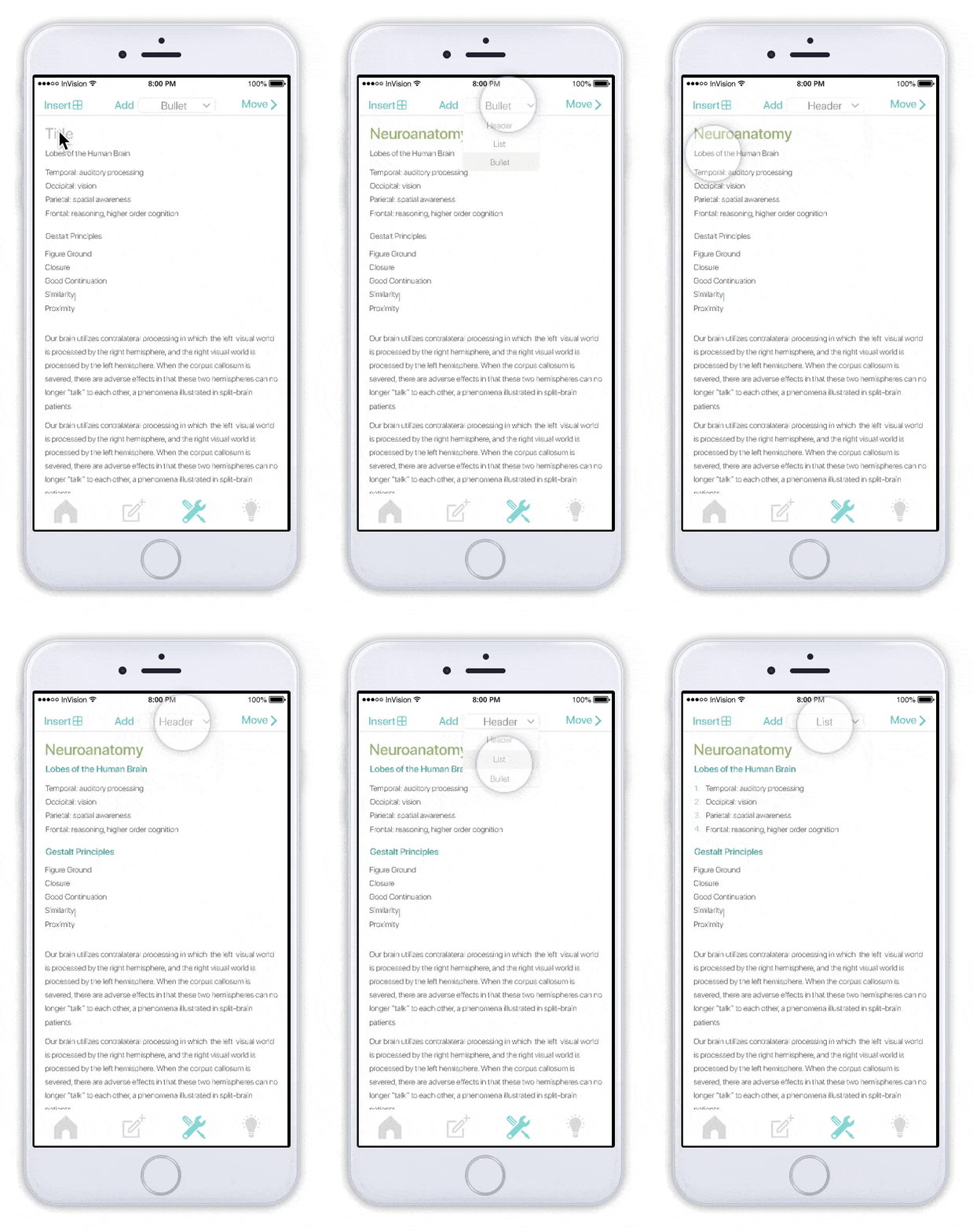
Format Note
Smart-formatting was a key component of the MVP. The greatest pain point among the interviewees was reformatting and organizing class notes because the process is so time consuming.
Smart-formatting allows users to “swipe” on the go so notes can be edited and organized without hassle.
Further Steps
This was my first UX Project completed from start to finish. For me, the biggest takeaway was learning to let go of what I personally thought was best, and letting the user’s needs take the lead.
Future Considerations
InVision was a great tool for simulating the MVP, but in the future, using Principle for more realistic animations may lead to better insight with users.
Users had a bit of a tough time figuring out the specifics of each feature. An on- boarding process guiding them through the app would clear up confusion
Real-Time collaboration was an important feature
Support for additional document types, many classes use PDFs, slides, and code/text editors…incorporating these in would be critical if our ultimate goal is to be an integrative note-taking platform
